Should a commercial display use IPS or VA?
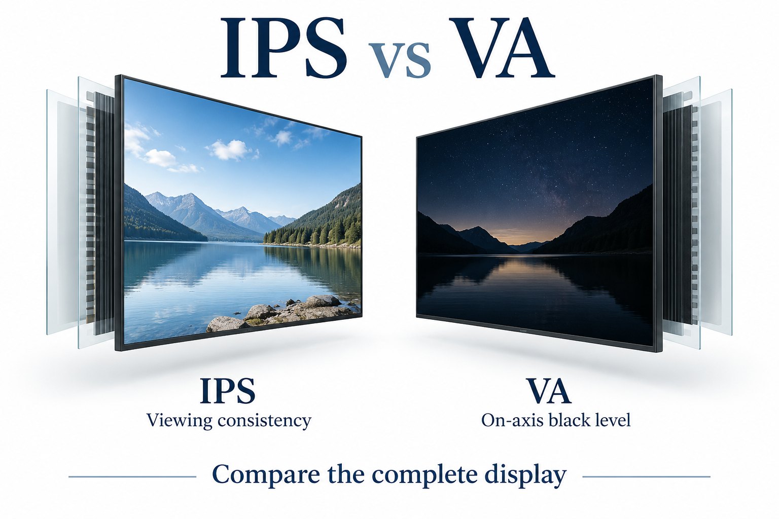
IPS is often considered for viewing consistency across several positions, while VA is often considered for strong on-axis contrast. The right choice depends on the complete display and the installation.
- Map the real audience positions and test the required orientation.
- Compare the same text, photographs and neutral backgrounds under matching lighting.
- Keep resolution, gamut, brightness and operating requirements separate from panel type.
- Approve the exact sample configuration rather than a family name or a quoted viewing-angle figure.
Start with where the audience stands and what they need to read. Then compare complete display samples at the intended brightness and orientation. A panel that looks excellent on a specification sheet may behave differently once protective glass, room lighting and the final content are involved.
What the IPS and VA labels describe
IPS means in-plane switching; VA means vertical alignment. Both describe how liquid crystals are arranged and controlled inside an LCD. The panel works with a backlight and optical layers to form an image. These labels do not identify the enclosure, media player, touch controller or installation rating.
Manufacturers offer several variants within each family. A general comparison is useful for creating a shortlist, but it should not replace the data sheet for the exact panel and assembled display. Avoid turning a tendency into a promise that every IPS or every VA product must meet.
EIZO’s explanation of panel technologies notes the importance of color stability at different viewing positions. It also separates color gamut from panel type. Those principles help with signage selection, although the historic numerical examples on that page should not be treated as specifications for current products.
For that technical background, see EIZO’s panel comparison. The selection process below applies those distinctions to commercial installations rather than desktop-monitor preferences.
Begin with the audience, not the panel name
Sketch the positions from which people will see the message. Include the approach from both sides, the closest stopping point and the far end of the queue. A menu viewed straight ahead has different priorities from a directory that visitors read while walking across a lobby.
Record mounting height as well as horizontal position. A high-mounted screen can be viewed from below even when the visitor stands directly in front. For a portrait display, repeat the assessment in portrait orientation; rotating the cabinet changes which panel direction faces each part of the audience.
Use the smallest text that matters to the task. Price digits, floor numbers and directional arrows are better acceptance targets than a colorful demo video alone. If those details become difficult to distinguish at a required position, a good-looking center view does not resolve the problem.
Define a practical reading zone before requesting samples. For example, your brief might require a customer to read a menu from the normal queue area. Describe that location with a drawing and distance measurements. Do not substitute an arbitrary universal viewing-angle target for the actual installation requirement.
Compare black levels under the same conditions
VA panels commonly offer strong native contrast on axis, while IPS designs often emphasize viewing consistency. There is substantial variation between models. Read the native or static contrast specification and the test conditions; a dynamic-contrast figure describes a different measurement and is not a direct replacement.
Place the samples in the same lighting and use comparable white luminance. Otherwise, the brighter display may appear more impressive without providing a fair comparison. Disable optional dynamic picture features for the baseline, record the settings, then assess the final operating mode separately.
Include dark-gray detail beside black areas, rather than showing only a full black screen. You want to know whether shadow details remain useful in the actual artwork. A promotional image with dark clothing or a dim architectural photograph can reveal differences that a saturated color chart hides.
Bright surroundings change the result. Reflections from windows and luminaires add visible light to the screen surface. A black-level advantage measured in a dark room can become less important in a brightly lit store. Evaluate the complete glass-and-panel assembly at the site, or recreate the relevant lighting.
Our guide to LCD contrast ratio explains the measurement question in more detail. Keep that assessment separate from brightness: more light output alone does not describe the darkness of black or the effect of reflections.
Check off-axis consistency with real content
Show the same menu, photograph and neutral-gray background on both candidates. View them from the marked positions without changing the content or picture preset. Note whether important colors, light-gray divisions and dark text remain distinguishable. The useful question is whether the message still works for the audience.
A stated 178-degree viewing angle does not mean the picture is unchanged throughout that range. Ask what criterion produced the rating. Two displays can carry similar headline angle figures while differing in visible contrast or color shifts at the positions that matter in your building.
For a row of menu boards, inspect the row from each end. The nearest panel and the farthest panel are seen at different angles. Also compare the panels directly from the center of the room. This separates a viewing-position effect from a mismatch between individual units.
Do not judge an entire panel family from a single phone photograph. Camera exposure, white balance and reflections can alter the apparent comparison. Use photographs as supporting records, with fixed settings where possible, and retain written observations of what the reviewer actually saw.
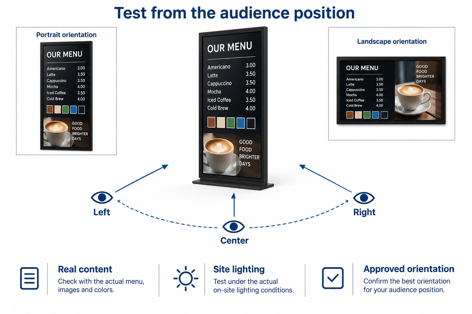
Match the panel assessment to the application
Menu boards and lobby information
For an audience spread across a room, viewing consistency deserves early attention. Shortlist displays that preserve readable text across the required positions. IPS may be a useful starting point, but the final decision should include brightness, surface treatment, content size and the available mounting positions.
A screen showing a fixed menu also needs an appropriate operating schedule and a maintenance plan. Those requirements belong to the finished commercial product. An IPS label does not establish continuous-operation suitability, and a VA label does not rule it out. Obtain the supplier’s documentation for the exact configuration.
Window-facing and outdoor signage
For a window, assess daylight readability through the actual glazing. Reflections, the gap behind the window and the direction of sunlight may outweigh a simple IPS-versus-VA preference. A brighter demonstration room is not automatically equivalent to the intended storefront.
Ask separately about the display’s approved environment, installation clearances and temperature limits. Do not infer outdoor suitability from panel technology. An indoor window-facing display and a weather-protected outdoor unit have different construction requirements, even if their LCD panel families are the same.
Use window-facing commercial displays as the product category starting point. Confirm the panel option, screen size and optical configuration for the project instead of assuming that every size uses an identical panel.
Interactive kiosks and video walls
A kiosk adds touch glass and a controller to the viewing task. Compare the assembled sample with its final front glass, not an uncovered panel. Check the screen from both standing and seated positions where those positions are part of the intended use.
For a video wall, uniformity between units is an additional requirement. Matching the family name is not enough to ensure a matched wall. Check the intended batch, calibration process and replacement strategy. A replacement panel should be assessed alongside the existing units rather than accepted solely because it is also IPS or VA.
Keep other specifications separate
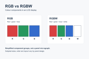
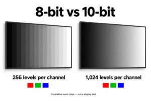
Resolution describes the pixel grid. Color gamut describes the range of colors. Color depth describes tonal encoding or display capability. Refresh rate describes how often the image is updated. None of these is fully determined by the words IPS or VA, so list them as separate requirements.
Motion quality also needs a sample check. Use the actual scrolling text and video material at the intended playback settings. A single response-time number may not describe every transition. For static menu artwork, prioritize readable text and stable presentation before chasing a motion specification that has little practical value.
Brightness and its control range should be assessed for daytime and quieter evening conditions. If automatic control is required, specify it explicitly. Panel technology does not establish that an ambient light sensor is present or that its brightness curve suits the installation.
Likewise, the panel name says nothing about connector support, player compatibility or remote control. Keep an interface list alongside the optical comparison. That prevents a visually suitable sample from being selected before anyone has checked how the project will deliver and manage its content.
A practical sample comparison sequence
First, identify both samples precisely: display model, size, panel option where disclosed, front-glass configuration and firmware. Save the data sheets supplied with them. If a detail is unavailable, mark it as unconfirmed instead of filling the gap from another product in the same range.
Next, use one known source and the same content files. Confirm that both displays receive the same output format and that neither stretches or crops the image unexpectedly. Establish a baseline picture mode before comparing. Differences introduced by the source should not be mistaken for panel behavior.
Then inspect the required audience positions under representative lighting. Use bright and dark artwork, neutral grays, small text and moving content. Record the observations against the reading task: a missing price digit matters more than a vague note that one picture feels more vivid.
Finally, repeat the relevant checks in the intended mounting orientation and operating mode. Allow the displays to reach a stable condition according to the supplier’s guidance. Keep ventilation clearances and installation instructions in place during the test so the sample represents an approved use.
Invite the people who create the content and maintain the displays to review the same sample. A content team may notice lost detail while an installer notices inaccessible connectors. Consolidating these observations before approval reduces the chance of selecting a screen that solves only one part of the project.
What to put in the purchasing brief
Describe the application, screen size, orientation, viewing zone and lighting conditions first. Add the content types and smallest required text. State whether the sample must include touch glass or other optical layers. These details give the supplier a clearer target than a request for a panel name alone.
If IPS or VA is a firm requirement, explain why and ask the supplier to confirm the delivered configuration. If it is only a preference, allow the supplier to propose an alternative sample that meets the same viewing task. This keeps the evaluation tied to performance rather than a label.
Request a consistent policy for component changes during a repeat order. The purpose is to know when another sample review is necessary. Record the approved configuration and the features that require notification if changed, such as the LCD panel, front glass or brightness-control behavior.
Agree how disagreements will be assessed before the order. Use approved content, lighting conditions, picture settings and viewing positions as the reference. A short, repeatable acceptance sheet is more useful than an unqualified statement that all screens must look perfect from every angle.
Common questions about IPS and VA signage
Is IPS always better for digital signage?
No. IPS can be a strong candidate when several viewing positions must remain consistent. A suitable VA display may work well where on-axis contrast is important. Choose using the full installation requirements and compare complete samples, including front glass and the final picture settings.
Does VA mean the screen cannot run all day?
No. Operating-hours approval belongs to the finished display and its documented conditions. Check the specific commercial product’s rating, cooling requirements and warranty terms. Panel family alone does not confirm or reject suitability for a long daily operating schedule.
Can the same product range use different panel types?
It can, depending on size and configuration. Ask for confirmation for the exact item being ordered. Do not transfer a specification from one screen size to another without evidence. The approved sample and the order documentation should describe the same configuration.
Should brightness or panel type come first?
Start with the application. A window-facing project needs sufficient readability in its lighting conditions, while a wide lobby audience needs consistency from multiple positions. Consider both requirements together. A panel preference should not distract from a visibility problem that the complete display still needs to solve.
Discuss the display configuration
For a commercial project, share your mounting drawing, viewing positions, lighting conditions and sample content with YJCEN’s team. We can discuss the display configuration to evaluate. Confirm the final panel and other specifications against the quotation and approved sample before ordering.