How should you compare LCD contrast ratios?
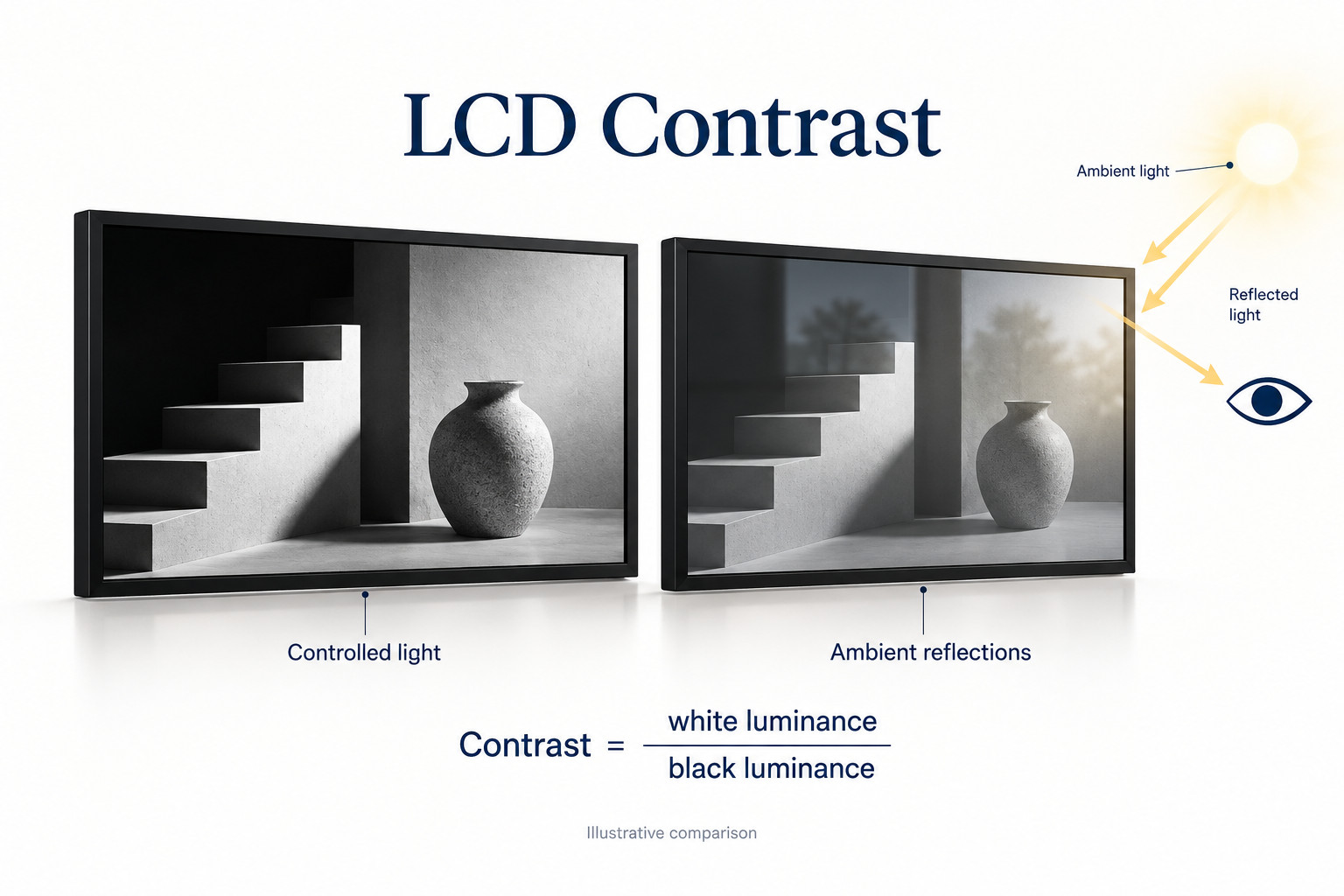
Contrast ratio compares measured white and black luminance under stated conditions. Compare figures only after checking how they were measured and how the display looks at the intended site.
- Separate native or static figures from dynamic processing claims.
- Record picture mode, brightness, test pattern and room lighting.
- Inspect shadow and highlight detail as well as overall black level.
- Use the same content and viewing positions; reflections can reduce practical contrast.
For digital signage, compare like-for-like measurements and then evaluate the complete screen in its intended setting. The picture mode, front glass, ambient light, viewing position and content all deserve attention. This guide explains which questions belong in a display comparison and which numbers should not be treated as equivalent.
What does a contrast ratio actually mean?
A ratio of 1,000:1 means that the measured white luminance is one thousand times the measured black luminance for that test. It does not mean the screen is one thousand times brighter than another display, and it does not specify how much light the screen produces.
For a simple arithmetic example, white at 500 cd/m² and black at 0.5 cd/m² give 1,000:1. These are illustrative numbers, not YJCEN product measurements. Without knowing both the measurement conditions and the display settings, the resulting ratio is incomplete information.
ViewSonic’s commercial-display purchasing paper treats contrast as a white-to-black luminance measure alongside other selection factors. That distinction is useful when a quotation presents contrast and brightness as if they were the same property.
Separate native, dynamic and measured contrast
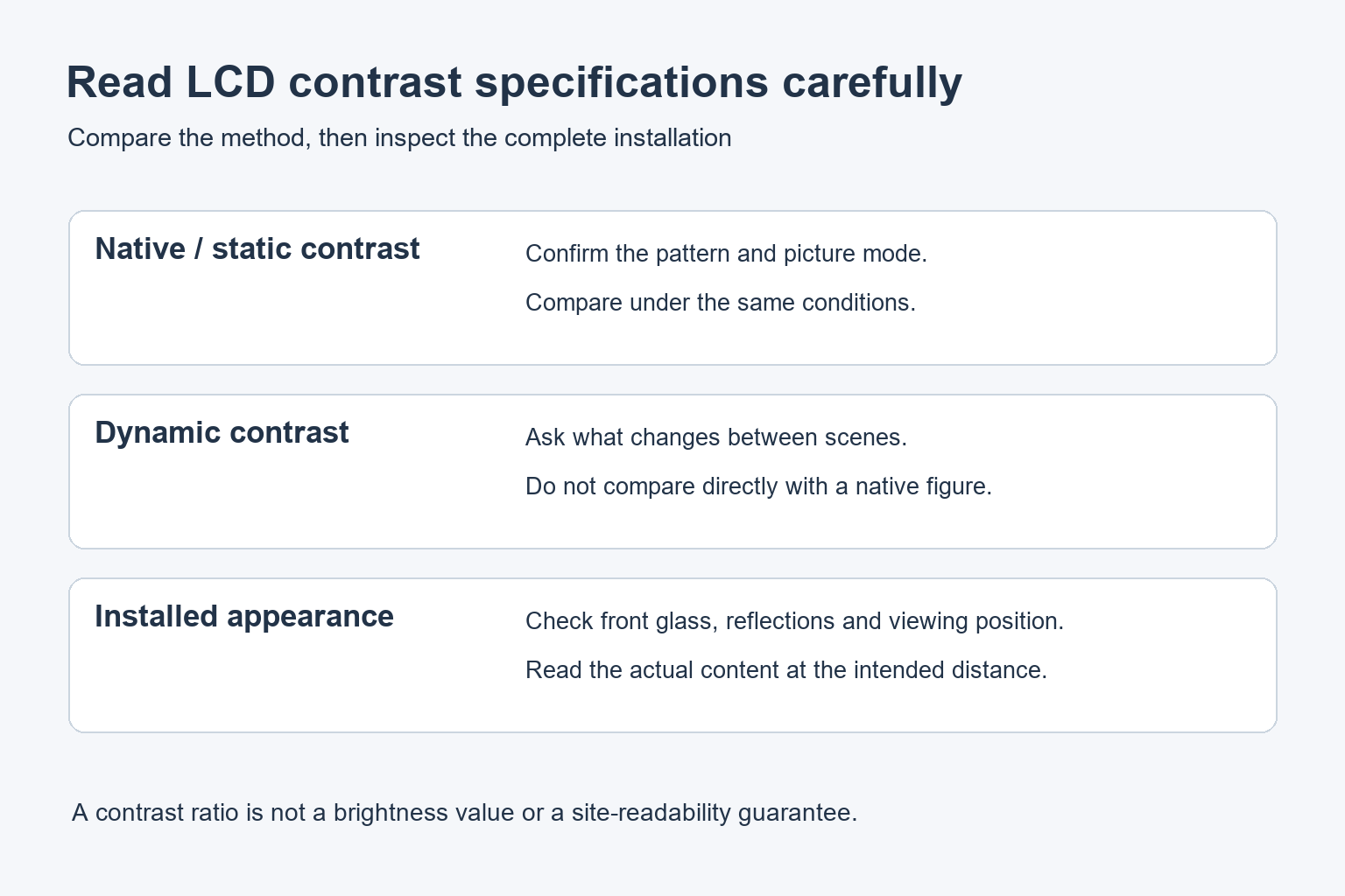
Native or static contrast
A native or static figure is intended to describe the display without scene-dependent changes being used to inflate the comparison. Still, ask for the measurement method. Two suppliers may use different patterns, settings or lighting conditions even when both figures carry the same label.
Dynamic contrast
Dynamic processing can change the backlight or image processing as the content changes. Its advertised ratio may therefore compare states that do not exist at the same moment. It should not be placed beside a native figure and treated as a directly comparable improvement.
EIZO’s discussion of LCD video performance explains that dynamic contrast changes the picture over time and can alter gradation or create visible brightness changes. For signage, evaluate what the mode does to the actual playlist, including bright menus and dark photographs.
Test patterns and measurement conditions
A sequential full-white/full-black test and a pattern containing light and dark regions together ask different questions. Ask which method was used rather than assuming every published figure comes from the same test. Keep automatic brightness and picture-processing settings documented when comparing samples.
| Reported item | What to clarify | Why it matters |
|---|---|---|
| Native contrast | Pattern, picture mode and lighting | Allows a more consistent comparison |
| Dynamic contrast | Which processing or dimming changes during the test | May describe different moments rather than one image |
| Brightness | White luminance and operating configuration | Does not establish black level by itself |
| Installed appearance | Front glass, reflections and viewing position | Determines what visitors can actually read |
Why a bright room changes the result
Light reflected from the screen reaches the viewer along with light produced by the display. A dark image area can therefore look gray in a bright room even when it looks deep black in a dark demonstration area. Compare samples at the site, or recreate the important lighting conditions as closely as possible.
Check the complete front assembly. A panel specification does not describe every reflection introduced by cover glass, a touch surface or the surrounding installation. Our guide to anti-glare and anti-reflective glass explains the different surface treatments. Confirm the actual configuration being quoted.
EIZO’s optical-bonding overview also describes how reflections within a display assembly affect visibility in bright conditions. Bonding is a separate construction choice; it does not make brightness, contrast and environmental suitability interchangeable specifications.
For a shop window, stand on the customer’s side of the glass. For an indoor information board, check the approach from the corridor. Include overhead lighting and the positions where reflections cross important text. A photograph taken straight in front of a sample cannot represent every viewing position.
Check detail as well as deep blacks
A picture can look punchy while losing useful information. Review dark steps in a grayscale pattern and light steps near white, then inspect real content. Product photographs should retain the details that customers need, and a dark background should not swallow menu labels or navigation controls.
Do not adjust the control labelled “contrast” simply to maximise the number shown in the menu. The setting’s behaviour depends on the display. Use its manual and check whether changing it removes highlight detail or alters the intended image. Save the original configuration before making adjustments.
Also confirm that the player and display agree on signal settings. If the same screen changes dramatically when connected to another source, investigate the signal path before blaming the panel. Change one setting at a time so that you can identify which step changed the picture.
How to compare two signage samples
Prepare a short test playlist before the demonstration. Include a readable menu, a grayscale pattern, a photograph with shadow detail and a bright branded layout. Use the same files on both samples and record the source, output format and selected picture mode.
- Confirm both samples use the proposed production configuration.
- Document brightness and automatic picture settings.
- Review dark and light detail before judging overall appearance.
- Read the smallest important text at the intended distance.
- Walk through the actual viewing angles and reflection positions.
- Watch several playlist transitions for unwanted brightness changes.
- Record acceptable settings and any unresolved differences.
When a formal measurement is required, agree on the instrument, method and conditions with the supplier or integrator. A phone photograph can document a visible concern, but automatic exposure and image processing make it unsuitable as proof of a numerical contrast ratio.
Keep the decision tied to the application. A reception display showing photographs and a bright menu board have different content priorities. Rather than setting an arbitrary universal minimum, define what must remain readable and which picture details must survive at the installed location.
Common procurement questions
Is a higher contrast ratio always better?
It can be useful when figures are measured on a comparable basis. It does not cancel reflections, poor content design or an unsuitable installation. Check the complete display and the intended viewing conditions.
Does high brightness guarantee good contrast?
No. Brightness states a light-output level; contrast also involves the black level and test conditions. Review both specifications and inspect the screen in the expected ambient light.
What should we ask YJCEN to confirm?
Send the installation location, typical content and viewing distance. For indoor commercial signage or a window-facing display, request the specifications of the proposed configuration and discuss a sample check before rollout.