How should you compare display colour gamut claims?
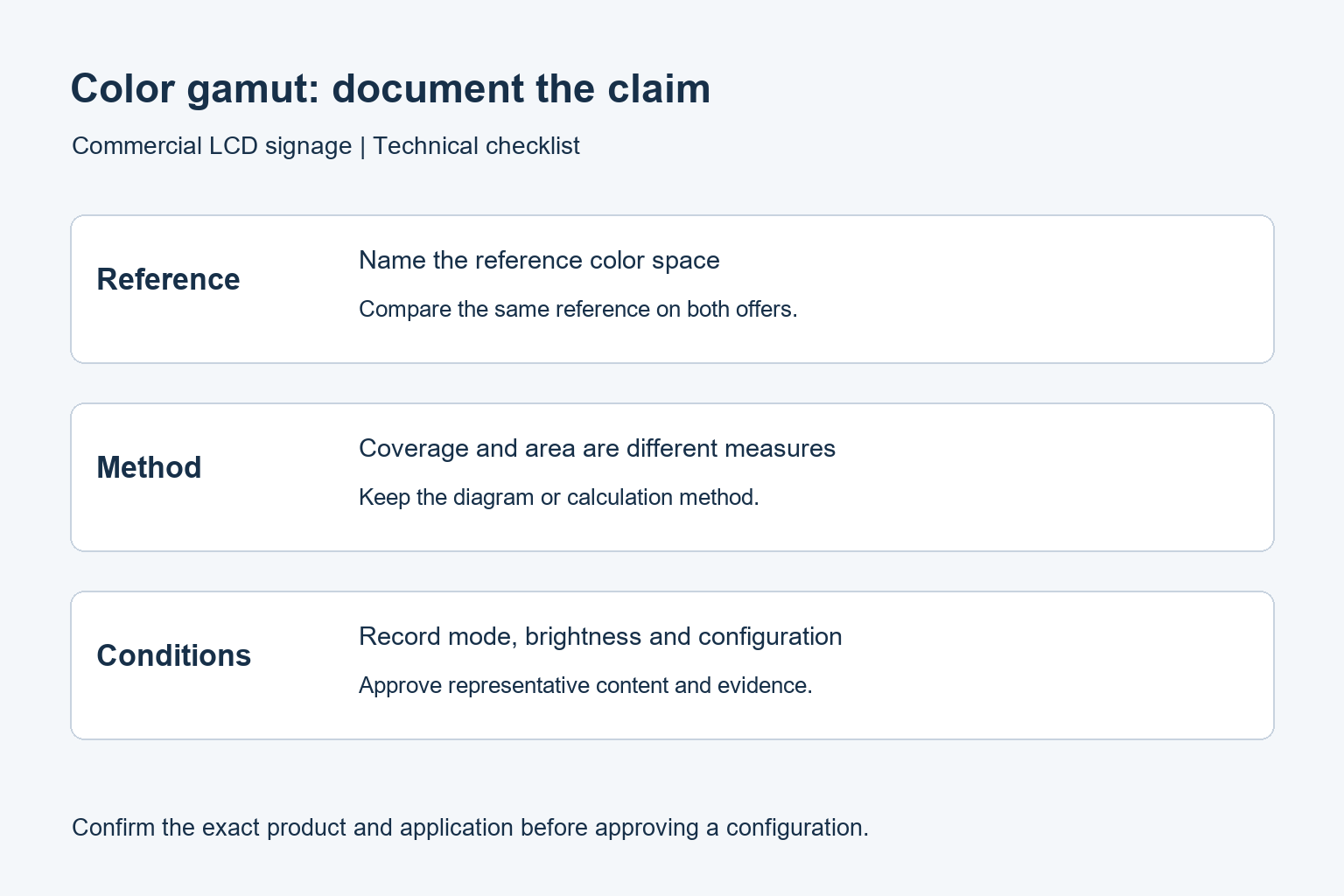
A useful gamut claim names the reference colour space and measurement method. A percentage alone is incomplete, and gamut is different from colour accuracy or consistency.
- Compare the same reference space and distinguish coverage from gamut area.
- Do not treat sRGB, NTSC and P3 percentages as interchangeable conversions.
- Test approved brand colours, neutral areas and photographs through the intended player.
- Record the model, picture mode, brightness and source-file settings used for approval.
Compare the display with the content workflow, not just another brochure number. This guide explains how to read sRGB, NTSC and other gamut claims, what to ask a supplier, and how to approve a commercial screen using representative files. It does not assign an unverified gamut figure to a YJCEN model.
Range, accuracy and consistency are different
Gamut describes the available color range. Accuracy describes how closely a displayed color matches its intended target under specified conditions. Consistency concerns how well appearance matches across the screen, between units or over time. One figure cannot answer all three questions.
A display may offer a wide native gamut while still needing the right input handling and picture mode for the content. For the basic definition and reference spaces, see EIZO’s color gamut explanation. Its technical principles are useful here, while individual product claims should remain tied to their own models.
In a retail project, write these requirements separately. The creative team may care about a particular red logo. The installer may need several screens to look alike. The purchasing team may need a repeatable specification for a replacement unit. Those are related requirements, but they need different evidence.
How to read a percentage
Identify the reference space
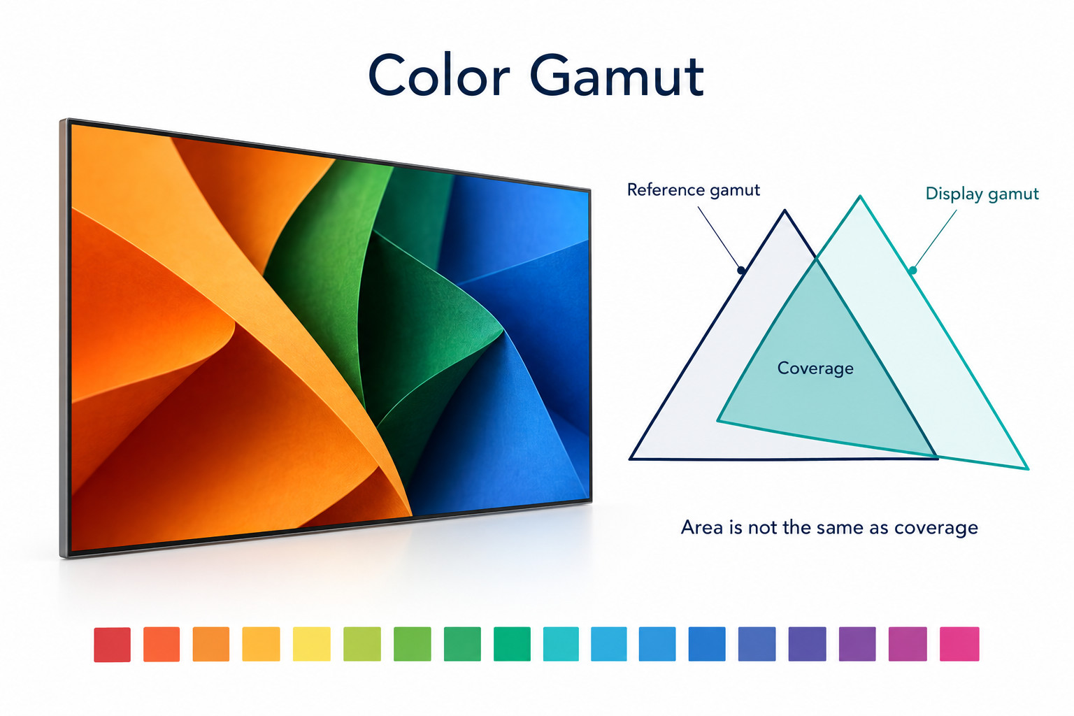
A claim such as “95%” is incomplete without a named reference. sRGB, Adobe RGB, NTSC and P3 do not describe identical regions. Compare like with like. Ask for the full reference name and the test conditions instead of placing unlike percentages in one ranking column.
Ask whether the number means coverage or area
Coverage asks how much of a reference gamut the display can reproduce. An area ratio compares sizes on a stated chromaticity diagram. A display’s region can extend outside the reference while missing part of it. Similar area therefore does not prove complete coverage.
Keep the diagram or calculation method with the quoted result. Do not automatically rewrite a percentage of NTSC as an equivalent percentage of sRGB. If a supplier only provides one kind of figure, request the measure that your project actually needs rather than inventing a conversion.
Confirm the operating mode
Ask which picture mode, brightness setting and panel configuration produced the result. The maximum native range may not describe a restricted color mode used for playback. Record whether the number is typical or guaranteed and whether it applies to every screen size in the quotation.
Match the content to the playback path
Start with the original files. Ask the designer which color space was used and how images or videos were exported. Keep the approved originals alongside the delivery files. This makes it easier to identify whether a later mismatch appeared during export, playback or display adjustment.
Then check the player and application. Do not assume every signage player handles embedded image profiles in the same way as the designer’s workstation. Play the final files through the actual production system. A correct-looking preview in design software does not verify the installed path.
For a mixed playlist, include photographs, flat brand colors, gradients and video. Record which file shows the concern. If only one asset differs, compare its export settings before changing the entire display setup. If every asset differs, investigate the common settings and signal path first.
A sample evaluation that answers buying questions
Use the proposed commercial screen and player in an environment close to the installation. Keep the room lighting stable during comparisons. Reflections and a changed viewing position can make informal judgments inconsistent, so document them rather than moving between conditions without notes.
- Select a small set of approved assets with important brand colors, neutral areas and natural photographs.
- Record the file versions, export settings, player configuration and display picture mode.
- Play those files through the intended input at the planned operating brightness.
- Review the result from normal customer viewing positions, including any important side approach.
- For a multi-screen installation, compare units together using the same files and settings.
- If color matching is a contractual requirement, agree on targets, instruments and acceptance tolerances before ordering.
Printed swatches can support a discussion with the creative team, but paper and illuminated screens are different media. A casual side-by-side comparison is not a measured pass result. Define the intended reference and viewing conditions when an exact color decision matters.
Common mistakes when comparing displays
Choosing the largest number regardless of the application
A wider quoted range does not solve every signage problem. Check that the required colors and workflow are supported, then consider readability, installation conditions and operating requirements. An indoor menu board and a window-facing advertising screen may have different priorities even when they use the same artwork.
Using a photograph as a gamut measurement
A photo of two screens includes camera exposure, processing and the device used to view that photo. It can document an observed mismatch, but it does not establish the screens’ measured gamut. Keep photos with settings and measurements rather than treating an attractive image as proof.
Confusing color count with gamut
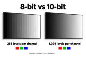
The number of available tone levels and the range those levels cover are separate properties. Bit depth or a quoted color count is not a replacement for a gamut specification. EIZO’s guide to display colors and lookup tables explains the distinction.
What belongs in the final specification
Record the exact model, panel configuration, reference color space, measurement method, picture mode and brightness. Include the content files used for approval and the person responsible for signing off the appearance. Keep an agreed procedure for replacement units so future purchases can be compared fairly.
For LCD video walls, also document how adjacent screens are matched. Our commercial display calibration guide covers that task. A gamut selection decision should lead into the commissioning process, not replace it.
For window-facing signage, assess the artwork in the expected daylight and evening conditions. Keep the color requirement alongside the brightness and viewing requirement. Do not approve a sample solely from a dark-room demonstration when the installed screen faces a bright shopfront.
Does every signage project need wide gamut?
No universal requirement fits every project. Begin with the content and the colors that must be reproduced, then verify the complete system. Where the current workflow already meets the agreed targets, a larger brochure figure alone does not demonstrate a useful improvement.
For projects with demanding artwork, involve the content owner early and agree on a measured review where needed. Share your display size, installation setting and content requirements with YJCEN so the proposed commercial display can be evaluated against a clear brief.