Does higher pixel density make signage easier to read?
Not automatically. Pixel density describes pixels per inch, while readability also depends on physical text size, viewing distance, content layout and scaling.
- Specify both the screen diagonal and native resolution.
- Keep artwork size, application canvas, player output and physical screen separate in the brief.
- Test the smallest important text from the real viewing positions.
- Review new layouts after content changes; a higher PPI figure does not replace an appropriate message size.
More PPI is not a complete answer to readability. A visitor must still be able to see the message from the intended position. Screen size, physical letter size, contrast, reflections and content layout all belong in the decision.
Resolution and pixel density answer different questions
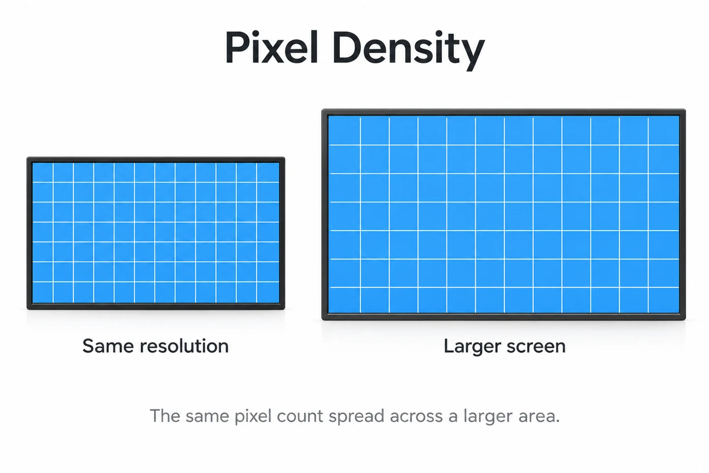
Resolution states the number of pixels across and down an image or panel. Pixel density relates those pixels to a physical length. If two screens have the same resolution and aspect ratio, the larger screen spreads the pixels over a larger area.
This distinction matters when a content design is reused across a signage network. The same file may fill screens of several sizes, but a letter’s physical height changes with the displayed image size. A design that looks comfortable at a desk needs a separate check at the installation.
How to calculate PPI
For a panel with square pixels, divide the diagonal pixel count by the diagonal size in inches. Calculate the diagonal pixel count from the horizontal and vertical resolution using the following expression:
PPI = square root of (horizontal pixels squared + vertical pixels squared) / diagonal inches.
For illustration, a 55-inch panel with 1920 × 1080 pixels works out to about 40.1 PPI. At the same 55-inch diagonal, 3840 × 2160 works out to about 80.1 PPI. These are mathematical examples, not specifications for a particular YJCEN model.
Doubling both horizontal and vertical resolution gives four times as many total pixels, while doubling PPI at the same physical size. Keep those quantities separate when comparing a sales description with a panel specification.
Why higher resolution does not automatically make text easier to read
A higher-resolution panel can represent finer detail, but the content must use it appropriately. If a layout keeps the same pixel-sized letters on a denser panel, those letters occupy less physical space. The result may be sharper yet harder to read from a distance.
Decide how large the message must appear before filling the canvas with more information. A wayfinding sign needs its destination and direction to stand out. Adding more lines because a screen has more pixels can work against that purpose.
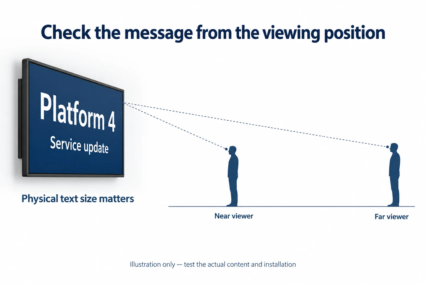
Inspect the complete content path. A sharp source graphic can still be resized by a player, application or display setting. Record the output resolution and check that the displayed layout is the intended one, including edges, orientation and scaling.
Use the viewing position as part of the specification
Identify where people first need to read the screen and where they can stand closest to it. Include side approaches, mounting height and any glass between the viewer and display. There is no single PPI number that guarantees readability in all these conditions.
For a lobby directory, the reader may stop close to the display. A menu above a counter has a different arrangement. A promotional screen seen while walking past may need a shorter message even when its panel has ample resolution.
Our LCD viewing angle guide covers another part of this assessment. Viewing angle and pixel density are separate specifications; one should not be used as a substitute for the other.
A practical content test before ordering
- Choose the actual screen size and supported native resolution being considered.
- Prepare representative content, including the smallest important text.
- Run it through the intended player or application, using the planned output mode.
- Mount or position the sample close to the proposed viewing arrangement.
- Check it from near, far and side positions under representative lighting.
- Adjust physical text size and layout, then repeat the check.
Ask someone unfamiliar with the layout to find the important message. Record what they were asked to identify and where they stood. This is a practical project check, not a substitute for any accessibility requirements that apply to the installation.
Keep screenshots of the content file and photographs of the sample arrangement as separate records. A screenshot can confirm the intended design. It cannot reproduce glare, physical size or the viewer’s distance from the installed display.
Specify both the panel and the content arrangement
A useful request includes screen diagonal, native resolution, orientation, approximate viewing positions and examples of the intended content. Include the planned media player or application when it affects scaling or supported output modes.
If one design must run on several screen sizes, check representative sizes rather than assuming the first sample covers them all. Document any changes in font size, column count or information density. Those decisions should travel with the content templates.
For touch kiosks, also consider the physical size and spacing of touch targets. PPI describes the display, not the accuracy of its touch sensor or the suitability of the interface. A visually sharp button can still be awkward to select.
Follow a message through the complete display path
There are several sizes to consider: the source artwork, the application’s canvas, the player’s output and the physical screen. Write them down separately. A file described as “4K” does not establish that every stage is presenting it at its original pixel dimensions.
Check whether the application fits, crops or stretches the content. Confirm that portrait material is shown in the intended orientation. A correct panel resolution does not prevent the content from being scaled or positioned differently somewhere earlier in the path.
Use a reference page containing recognizable edges, labels and shapes. Compare what the content designer intended with what the complete system displays. A circle that becomes an oval or a cut-off label is a layout issue to investigate before drawing conclusions about panel density.
Read a PPI comparison without losing the physical scale
Consider two mathematical examples with the same 1920 × 1080 resolution. A 55-inch diagonal gives about 40.1 PPI; a 75-inch diagonal gives about 29.4 PPI. The larger screen has lower density, but the same full-screen layout also appears physically larger.
That larger physical image may matter more for a distant viewer than the PPI figure alone. This is not a rule that larger is always better. It shows why a screen’s specification and its viewing arrangement have to be assessed together.
At a fixed physical size, doubling both pixel dimensions doubles PPI. Whether that extra detail is useful depends on the source content and how it is displayed. A low-resolution image stretched to fill the screen does not gain original detail simply because the panel has more pixels.
The examples use nominal diagonals and square pixels. They are calculations for explaining the relationship, not measurements or promises about particular products. Use the chosen panel’s documentation when preparing a project specification.
Use physical dimensions for important content
If the content team describes an element only in pixels, convert that dimension into physical size for the proposed screen. For a one-to-one image mapping, a block’s width in inches equals its width in pixels divided by the panel’s PPI.
For example, a 100-pixel-wide block on a 40-PPI display is 2.5 inches wide. On an 80-PPI display it is 1.25 inches wide. These rounded numbers illustrate the calculation; they do not specify a recommended text or button size.
A font’s nominal pixel size is not necessarily the height of its visible letters. Use the actual rendered content when checking text. Letter shapes, stroke thickness, spacing and the contrast with the background affect how readily the message can be recognized.
For essential directions, agree on the required physical presentation and test it. Avoid treating an attractive design on a content creator’s screen as evidence that the same message will be readable from the far side of a lobby.
Keep pixel pitch, PPI and print DPI distinct
Pixel pitch is the spacing between adjacent pixel centers, often expressed in millimeters. With square pixels and consistent units, pitch in millimeters is 25.4 divided by PPI. It describes spacing, while PPI describes how many pixels fit into a length.
DPI is commonly used in printing and can refer to printer dots. A print file’s DPI label does not change the physical pixel grid of an LCD. For signage, check the actual image dimensions, the way the application scales them and the screen’s native resolution.
Direct-view LED signage also uses pixel pitch terminology. That does not make an LCD and an LED sign otherwise equivalent. Their construction and the installation requirements still need separate evaluation. Do not carry a viewing-distance rule from one product category into another without checking it.
Design for the task the viewer needs to complete
Finding a direction
A directory or wayfinding screen should make its main destination and direction easy to locate. Test the hierarchy of information. If the reader has to scan a dense block of small text, adding resolution may leave the underlying content problem unchanged.
Reading a menu
Check the names, prices and essential details from the customer’s position. Use representative content rather than unusually short placeholder names. Include the busiest normal layout, then simplify it if the intended information is difficult to find.
Using a touch kiosk
Test both reading and selection. The touch target, the visible label and the spacing between neighboring controls need to work together. Validate the interface with the intended application and orientation; a high PPI figure does not certify usability.
Write a repeatable acceptance record
Save the content version, player output, display mode, orientation and relevant scaling settings. Add the screen size, the viewer positions and the lighting conditions. These details make it possible to repeat a comparison after content or hardware changes.
Record a specific task, such as identifying a destination or reading an important price. Describe any difficulty instead of recording only “looks sharp.” Sharp edges are useful, but the project needs people to recognize the correct information.
When changing screen size, repeat the physical check even if the file and resolution stay the same. When changing resolution, repeat it even if the cabinet size stays the same. These are different changes, and each can alter how content is presented.
Common questions about signage pixel density
Is a higher PPI always better for a distant audience?
No single density figure answers that question. A distant reader needs an appropriately sized message. Compare the actual content on the proposed screen from the intended position, then decide whether resolution, size or layout needs to change.
Does 4K guarantee that a menu will be readable?
No. The file, playback path, layout and physical text size all matter. A high-resolution panel can display an unsuitable layout just as accurately as a suitable one. Check the finished presentation rather than relying on the resolution label.
Should every screen in a network use the same content file?
A common file can be convenient, but it still needs validation for the supported sizes and orientations. Where the layouts differ, maintain approved versions and clear publishing rules. Do not assume every screen will scale the content in the same way.
Where pixel density belongs in a buying decision
Use PPI to understand the relationship between resolution and size. Then test the complete display with the message and viewing arrangement that matter to the project. Avoid choosing a smaller screen solely because its PPI figure is higher.
YJCEN offers floor-standing digital signage and other commercial display formats. Send the proposed location, screen size and content example to discuss the configuration. Confirm the selected model’s actual resolution rather than assuming one value across the range.
Check a content change before sending it to every screen
A hardware choice can remain suitable while a new layout becomes difficult to read. Treat changes to columns, font sizes and information hierarchy as changes that need review. A denser menu or a longer directory entry can alter readability without changing the display specification.
Keep a small set of representative layouts for testing. Include a long product name, a typical price, a direction with an arrow and any essential secondary text used by the project. Use realistic content lengths rather than short placeholders that make the design appear more spacious.
When the same material appears on landscape and portrait screens, approve each layout separately. Rotating or cropping a file can change the available space and the relationship between the headline and supporting information. Record the intended template for each orientation.
Review the result from the farthest normal reading position before adding more detail. If the main message is difficult to recognize, try a simpler hierarchy and larger physical lettering. Recheck the output settings as well; changing the content should not conceal a scaling mistake.
For interactive information, check the screen at each important step in the task. The opening page may be clear while a later selection list becomes crowded. Keep the text and touch checks together, while remembering that panel density and touch performance remain separate properties.
After approval, retain the content version and a short description of the tested arrangement. These records help staff distinguish a new layout issue from a hardware change. They also make it easier to reuse a successful design without assuming that it will fit every size or viewing distance.
Technical reference
EIZO: pixel density, resolution and display scaling. The signage planning checks above apply those distinctions to commercial content and installation decisions.