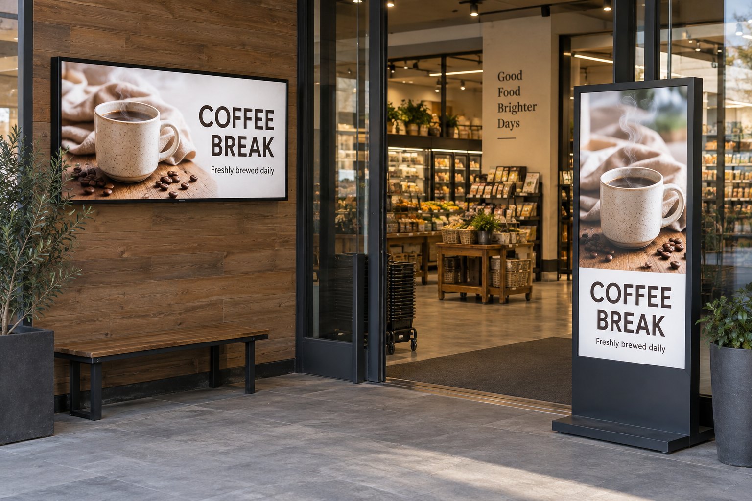
What makes digital signage content easy to use?
Give each slide one clear message and a useful next step. Build it for the actual screen and the time viewers have to read it.
- Match orientation, aspect ratio and player output before creating artwork.
- Prioritise a readable headline, essential details and relevant imagery.
- Test reading time instead of copying one fixed slide duration.
- Assign an owner and expiry date, then review the complete playlist on the installed display before publishing.
This guide covers content planning, screen dimensions, readability and everyday publishing. It is for teams creating messages for retail, reception areas, workplaces and other commercial display locations.
Decide what the viewer should understand or do
Write the purpose of a slide in one sentence before opening a design tool. “Help visitors find reception” is a useful brief. “Show our company information” is too broad to guide a layout. If a slide needs several unrelated actions, divide it into separate messages or assign them to different screens.
| Screen location | Viewer’s question | Useful message | What to leave elsewhere |
|---|---|---|---|
| Reception | Where do I go? | Welcome, destination and next step | Full company history |
| Retail entrance | What is available here? | One current offer or product group | The complete catalog |
| Service counter | What can I order? | Readable choices and current information | Long brand videos that interrupt the menu |
| Employee area | What has changed? | A dated notice with an owner or action | A full spreadsheet squeezed onto a slide |
A person walking past an entrance has less reading time than someone waiting in a lounge. Use that difference when deciding how much information belongs on a screen. A short message can lead to a website or staff member when the subject needs more explanation.
Build for the screen’s actual shape
Confirm the display orientation and the player’s output resolution before creating templates. For a 1920 × 1080 landscape canvas, the aspect ratio is 16:9. A 1080 × 1920 portrait canvas is 9:16. They contain the same number of pixels but need different compositions.
Do not rotate a finished landscape advertisement and expect it to become a useful portrait layout. Move the image, rewrite line breaks and reposition the call to action. Keep important content away from the edges so that small placement or scaling differences do not clip it.
| Example canvas | Shape | Design approach |
|---|---|---|
| 1920 × 1080 | Landscape, 16:9 | Image and message can sit side by side |
| 1080 × 1920 | Portrait, 9:16 | Stack the heading, image and next step |
| 3840 × 2160 | Landscape, 16:9 | Use suitable source images; do not fill extra pixels with tiny text |
| Model-specific dimensions | Stretched or unusual format | Build a dedicated template from the specified canvas |
These are example canvases, not a promise that every display or player supports them. For a stretched bar LCD display, request the exact active resolution and playback requirements. A conventional slide forced into a narrow strip is likely to lose useful content or distort the image.
Make the headline readable before adding detail
Give the viewer an obvious order: headline first, supporting information second, action last. Use a small set of type styles and keep the body copy brief. Avoid putting several equally bold headings on one screen; the audience then has to decide which one matters.
Test at the actual viewing distance. There is no single font size that works for every screen, mounting height and room. Display a sample slide, stand where the audience will be and check the smallest essential text. If it fails, simplify the message or enlarge it before polishing decoration.
Strong text-to-background contrast is a useful starting point. The W3C contrast guidance for web content uses 4.5:1 for ordinary text and 3:1 for large text. Those can inform a design review, but physical signage still needs checks for glare, distance and lighting; the ratios alone do not establish installation accessibility.
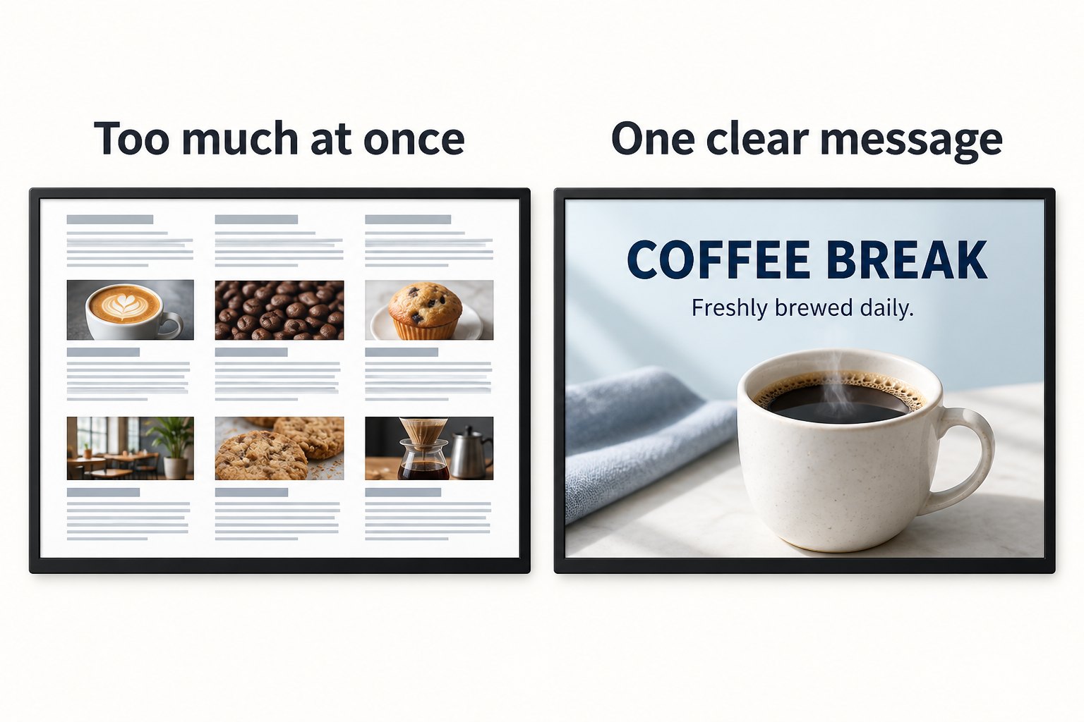
In the comparison above, the clearer screen uses one coffee image, one headline and one supporting line. The improvement comes from removing competing information. Adding a higher-resolution panel would not fix the crowded layout on the left.
Use images and motion with a purpose
Choose a photograph that shows the product, destination or activity discussed in the text. Crop within the content design so the relevant subject stays visible in each format. Do not place text across a busy area of a photograph without a sufficiently clear background behind it.
Use files that the selected player can decode reliably. Confirm image formats, video codec, resolution and frame-rate limits with its documentation. A filename ending in .mp4 does not describe every technical property of a video. Test the exported file on the intended device before distributing it to all screens.
Motion should help explain the message, such as showing a short product demonstration. Keep routine timetables and directions stable enough to read. If a video’s speech matters, include captions; many commercial locations have background noise or operate screens without sound.
Set slide duration around reading time
Time the message using someone who has not written it. Give them enough time to notice the slide, read it and understand the action. A fixed duration copied from another installation may be too short for a detailed notice or too long for a simple direction.
Keep essential information visible where people need it. A menu or current-room notice should not disappear for a long advertising rotation. Consider a separate screen or a carefully sized persistent area, provided it remains readable. More zones are not automatically more useful.
Schedule content around opening hours, service periods and local time. A breakfast message should expire when breakfast ends. For locations in different countries, check time zones and date formats. Preview the actual next scheduled item as well as the slide currently on screen.
Give every temporary message an owner and expiry date
A simple content register helps prevent outdated screens. Record the message, target locations, start time, end time, owner and approval status. This can be a small shared sheet if that is enough for the team; the important part is that someone maintains it.
- Keep an approved master template for each screen shape.
- Name files so staff can identify the message and version.
- Assign a backup who can remove urgent or incorrect content.
- Check prices, dates, directions and links before publication.
- Remove expired material from both the playlist and the active working folder.
For live information, also define what should happen when its source stops updating. A cached promotion may remain usable; a stale appointment or room-change feed may not. Our online and offline signage guide covers playback considerations when a network connection is unavailable.
Review the finished content on the installed display
A laptop preview is a useful first check, but the final review belongs in the viewing space. Brightness, reflections, scaling and playback behavior can change the result. Check both the busiest viewing period and a quieter period with different lighting.
- Confirm orientation, aspect ratio and that no important text is clipped.
- Read the smallest essential line from the intended audience position.
- Watch the full rotation and check timing and transitions.
- Test QR codes and links with the published destination.
- Check a restart and any scheduled change or expiry.
- Ask a first-time viewer to explain the message and next step.
If people miss the message, revise one element at a time: heading, amount of text, image or placement. Compare the same task before and after the change. Avoid treating animation counts or the number of slides as evidence that communication has improved.
Common content questions
Can we reuse a social media post?
Use it as a source, then adapt it. Remove platform controls and small captions, check image rights and rebuild for the display shape. Social posts designed for close viewing on a phone often contain detail that will not be readable across a room.
Should we fill the whole screen with information?
No. Space around a heading or image helps separate it from other elements. Use the screen to make the important information easy to find. Put extended explanations on a suitable web page or printed document when they need more reading time.
Does better content require different hardware?
Sometimes, if the existing screen is unsuitable for the lighting, size or operating schedule. First check whether layout and placement changes solve the problem. Review indoor digital signage hardware against the location, and send YJCEN your display and playback requirements when planning a replacement.