What does a useful digital wayfinding system need?
It should show where the visitor is, where the destination is and what to do next. The map and route must agree with the physical site.
- Use destination names visitors recognise and place guidance before confusing decisions.
- Give each kiosk the correct starting position and orientation.
- Check route options, access restrictions and temporary closures with the venue team.
- Confirm the mapping software, update owner and fallback, then test real journeys with first-time visitors.
The screen is only one part of that job. Room names, route data, kiosk placement and daily updates determine whether the directions remain useful. Before selecting a touchscreen, map the visitor journey and decide who will keep that information correct.
Choose the type of guidance your visitors need
A small building may need a clear directory near the entrance. A larger site may need destination search, several floors and different routes. Begin with the decisions visitors struggle with, rather than assuming that every location needs an interactive map.
| Format | Useful for | What to plan |
|---|---|---|
| Digital directory or directional screen | Showing a short list of destinations or the next turn. | Readable names, consistent arrows and information relevant to that location. |
| Interactive wayfinding kiosk | Searching many destinations and choosing a route. | Touch controls, map data, kiosk position and application support. |
| Directions carried to a phone | Keeping route instructions available after leaving the kiosk. | A supported handoff method, mobile readability and network requirements. |
These formats can work together. An entrance kiosk may help someone choose a destination, while a simple screen at a junction confirms the next turn. Use the same destination names across both so the visitor does not have to interpret a second naming system.
Start with a destination list and a walk through the site
Collect the names people actually search for: departments, room numbers, tenant names and common amenities. A visitor may know a clinic by its public name while a facilities drawing uses only a room code. Keep one approved destination record with useful alternative names.
Walk the routes from each public entrance. Note junctions, lifts, stairs, locked doors and places where visitors tend to stop. A clean floor plan does not tell you whether a doorway is visible or whether an apparent shortcut is open during visiting hours.
For each destination, record the public label, floor, access point and responsible contact. Add opening restrictions where relevant. If a department moves, that record should tell the editor which map label and route instructions need to change.
Keep naming consistent with the signs already on the walls. A screen that directs people to the “East Wing” is unhelpful if the corridor signs say “Building B.” Resolve those differences before building the interface.
Place the kiosk before the confusing decision
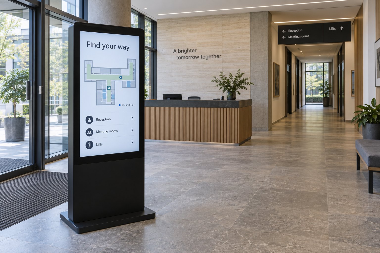
Locate a wayfinding screen where people can notice it, stop and use it without blocking circulation. An impressive central position can be less useful than a quieter spot just before a junction. Check the view from the entrance, not only from a photograph taken directly in front.
A touch screen information kiosk gives users a dedicated place to search. A wall-mounted digital signage display can show directions where space is limited. The mounting arrangement should suit the task and leave room for people to approach and turn.
Test the touch controls from different user positions. Readable content high on the screen does not mean every button is comfortable to reach. Keep essential search and route controls easy to find, and provide a clear way to restart after the previous visitor leaves.
Also inspect reflections, power access and maintenance access. A map that is readable in a design file may be difficult to see beneath a bright ceiling light. Position the sample before committing to the final installation.
Make the map match the person standing in front of it
Give each fixed kiosk its own starting position. The same map file displayed at two entrances can produce the wrong directions if the software treats both screens as the same location. Confirm the device-to-location assignment during installation.
Make the “You are here” marker easy to identify. Check that the orientation and first instruction make sense from that screen. Visitors should not have to mentally rotate an unfamiliar building before deciding whether to turn left or right.
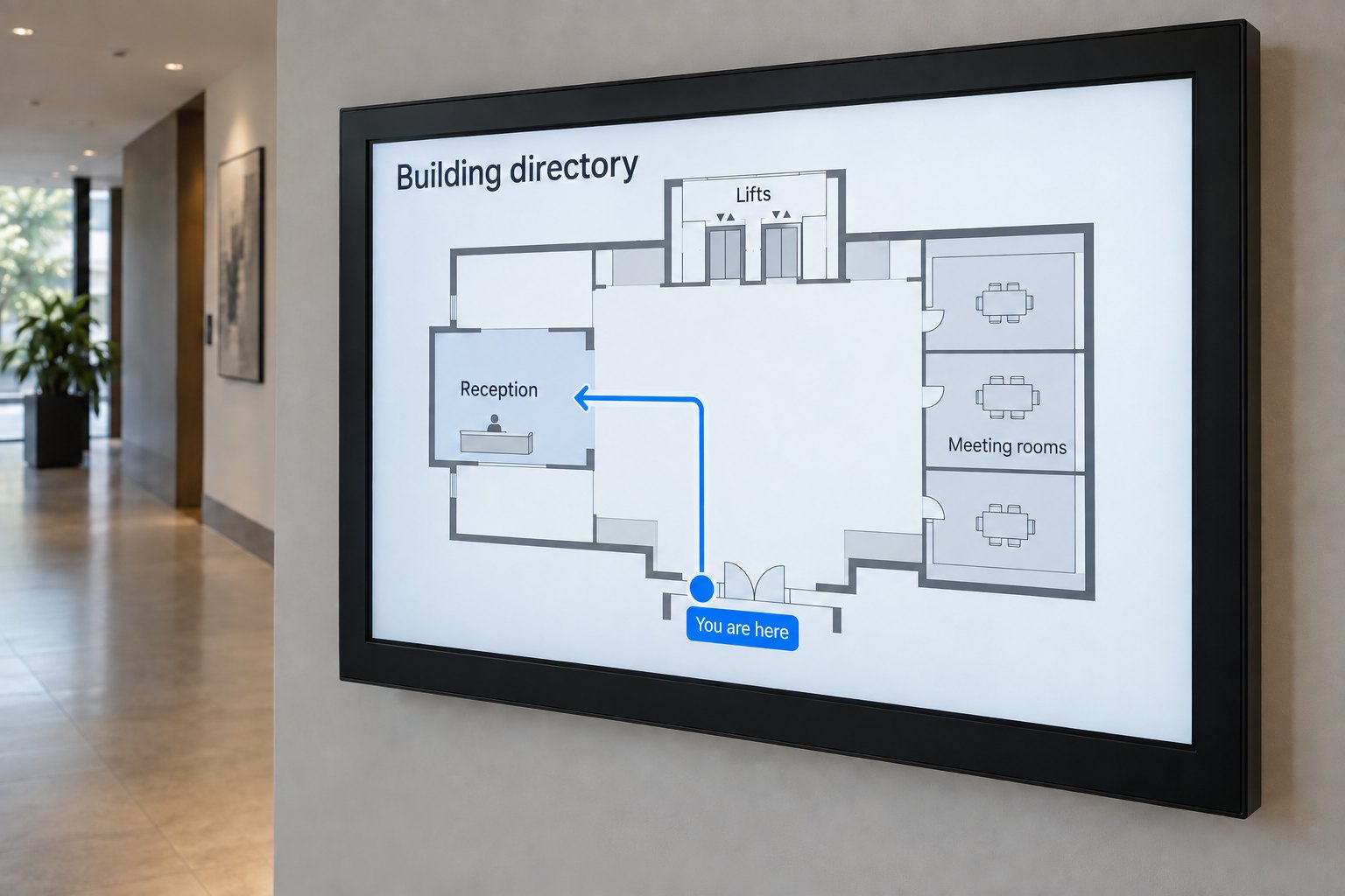
Show a short route with recognisable landmarks. “Pass reception, then turn left at the lifts” can be easier to follow than a line on a dense floor plan. For multi-floor journeys, make the floor change explicit and show where the visitor continues after leaving the lift.
Do not display every technical room, service corridor or drawing layer. Select the information needed for the public journey. A simpler map also gives the destination label and route more space on smaller displays.
Check the route itself, not just its appearance on screen
A shorter route is not always the appropriate route. Stairs, access restrictions and temporary closures can change which path a visitor can use. Define route options with the facilities team and verify them on the ground before publishing them.
For US projects, the US Access Board’s accessible-routes guide explains how accessible paths connect entrances and spaces. Use the applicable local requirements for the actual site. A route drawn on a map cannot establish the accessibility of the physical building or installed kiosk.
Review the whole journey with users who have different access needs. Include the approach to the screen, the controls, the directions and the destination entrance. Provide another practical way to obtain help when a visitor cannot use the touchscreen.
Separate display hardware from mapping software
Destination search, route calculation and map editing are application functions. A touchscreen does not include them automatically. Ask the software provider which operating systems, browsers, touch inputs and network conditions it supports before specifying the player.
For example, 22Miles’ wayfinding documentation describes map editing, route closures and mobile handoff features. These are useful items to review in a software demonstration, not features that should be assumed on every kiosk or treated as confirmed YJCEN compatibility.
Run the proposed application on the exact hardware configuration. Check search speed, map movement, touch accuracy and restart behaviour. Include the largest planned map and a multi-floor route; a simple opening screen is not enough to assess the full experience.
Decide what happens when information or connectivity changes
Assign an editor and a backup person for destination changes. Give them a clear process for closing a route, correcting a label and checking the public result. A screen can be powered on and healthy while its directions are already out of date.
Test a network interruption. Determine whether maps, search and directions remain available locally, and which functions require a live service. Our online and offline digital signage guide explains why these behaviours depend on the player and application.
If a route cannot be trusted, show a helpful alternative such as the reception location. Keep ordinary visitor navigation separate from the site’s emergency arrangements; do not assume a normal wayfinding application can replace required evacuation signs or procedures.
Run a short pilot before expanding the system
Ask first-time visitors to find several real destinations without coaching. Watch where they hesitate, which terms they type and whether they take the intended first turn. Record the problem rather than explaining the interface to them during the task.
- Can visitors find the kiosk from the entrance?
- Does search recognise the destination names they use?
- Do map orientation and the first turn agree with the physical site?
- Are floor changes, closures and alternative routes clear?
- Does the screen return to a useful starting view for the next person?
- Can the editor make a correction and confirm it on the public screen?
Use the findings to revise labels, placement or the route before adding more screens. For a hardware review, send YJCEN the floor plan, proposed screen positions and software requirements. That gives us a practical basis for discussing the display, mounting and player configuration.